How a rebrand can drive income generation, visibility and social impact … and win awards
How a rebrand can drive income generation, visibility and social impact … and win awards
By
David Carroll
What does it take to build a brand that survives a global pandemic, transforms an organisation’s financial position, and becomes a sector exemplar? David Carroll of DC&CO tells the full story of a seven-year creative partnership with The Story Museum in Oxford, from the building site walks that unlocked the identity to the results that won Silver at the DBA Design Effectiveness Awards 2026.
An underdog story, a pandemic, and a brand that had to earn its keep
This is at its heart a classic underdog story. The Story Museum in Oxford was competing with world famous cultural institutions. It had a fragmented identity, a limited budget, and a planned reopening that was hit by the first national Covid lockdown.
The Story Museum emerged from all of that with income three times its pre-redevelopment level, visitor numbers that have consistently outperformed the national recovery average, and a brand cited by Art Fund as a leading example of emotional branding done right.
Three objectives, one brief
Before we began any creative work, DC&CO established three clear business objectives with the Museum.
The first was to increase income and visitor numbers: to design a brand confident enough to keep the Museum front of mind, attract new audiences, and grow earned income.
Second was to put the Museum on the map: to create an identity distinctive enough to build genuine recognition, both for the physical building on its difficult-to-find street and for the Museum’s growing online presence.
The third was to make it easy to work with: to design a brand that a non-specialist team could maintain and apply in-house, without needing to commission an agency every time a new piece of communication was needed.
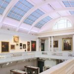
Oxford’s best kept secret
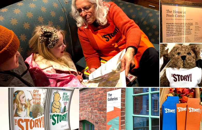
The Story Museum is not a conventional museum. There are no objects behind glass, no hushed galleries. Since it first opened in 2014, it has been an extraordinary mix of museum, art gallery and immersive theatre, inviting both children and adults to find an emotional connection with stories. Visitors can push through a wardrobe full of fur coats into Narnia, slice into Pullman’s Oxford with the Subtle Knife, play Poohsticks on a hi-tech river, or sit on the Snowman’s sofa. The original meaning of ‘museum’ is a sacred place for the Muses. That is what this is.
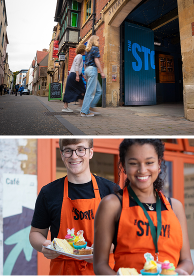
When we were commissioned, during a £6 million redevelopment, the Museum was popular with those lucky enough to stumble upon it but virtually invisible to everyone else. A tricky location, down a narrow side street, coupled with having to compete against Oxford giants such as the Oxford Museum of Modern Art, The Ashmolean, The Bodleian, the Pitt Rivers Museum meant drawing passing footfall was tough. Income stood at £350,000 a year. Visitors at around 21,000.
The brand had fragmented and so wasn’t building equity in the main brand. It focused on books, not on wider storytelling. Its positioning as ‘The most unusual museum,’ no longer captured what the organisation had become or where it wanted to go.
How we worked
We spent months immersing ourselves in The Story Museum world. Walking the unique and quirky space, exploring what they believed, what they hope to become and who they were not yet reaching.
That immersion matters more than almost anything else we do. A brand that an organisation truly inhabits has to come from inside the organisation, not be imposed upon it from outside. The Story Museum’s team are thoughtful, passionate people with a genuinely distinctive idea about what stories could do for people.
We explored a huge range of directions: portals, fairy tales, skies, dragons, magic. The idea of ‘story’ has many different starting points and it meant different things to different members of the team. None of those early directions were wrong. They were all part of the process of finding the right one.
The building told us how
The breakthrough came from an unexpected place.
The site consisted of three interconnected buildings: an old tavern, a defunct telephone exchange, and a postal office, all arranged around a wonderful courtyard. Walking through it, even half-finished, was an experience of corridors that turned unexpectedly, rooms that revealed themselves through low doorways, spaces that opened onto other spaces. The building was a warren of corners and surprises.
That physical experience was the answer, not a metaphor, not a concept, the actual architecture of the place. The strategic work had established what the Museum needed to express. The building told us how.
The identity needed to come from how visitors feel when they move through it, not from what the Museum wanted to tell them. That single shift changed everything.
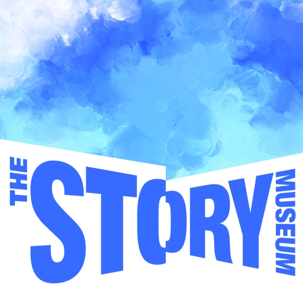
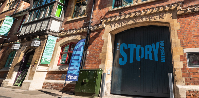
The split ‘O’ in the logo, bold, dramatic, large enough to dominate the entrance gates on a narrow street, echoes the corridors directly. The gap in the letter is the doorway. The division is the liminal moment of moving from one space into another. And it produced a positioning that is genuinely true, genuinely surprising, and genuinely distinctive: A surprise around every corner.
The word STORY dominates the logo. MUSEUM sits small, almost secondary. That was intentional. We did not want the word ‘museum’ to carry associations of stillness and formality that belong to a different kind of institution entirely. By leading with STORY at every scale, from the website to the entrance gates to the pocket-money items in the gift shop, we signal what is actually waiting inside.
“The new identity brilliantly expresses the spirit of The Story Museum to our many and very different stakeholders.” Kim Pickin, Founder, The Story Museum
Art Fund later described the visual style as “powerful and contemporary, not at all soft or childlike.” That was exactly right.
What we built
Beyond the logo and brand guidelines, we created a complete wayfinding system to produce a cohesive experience across the Museum and strengthen its sense of place. We designed the first season guide in 2020, which became the template for every guide produced over the next five years. We briefed the website agency on the new identity and reviewed their work. We briefed the marketing team on implementation strategy. In 2025, we redesigned the season guide in a shorter format to reduce costs, cutting print spend by 46% and saving £5,514 per year.
A key structural decision was to radically simplify the brand architecture. Only the café has its own logo. Everything else lives under the main brand. That simplicity is part of what makes the system so usable and so durable.
We also made specific choices to accommodate the reality that The Story Museum team are not specialists: free Google Fonts rather than licensed typefaces, a flexible graphic edge system that works at any scale without specialist software, and guidelines written for humans.
“Because the brand has been designed to last, it’s still looking fresh and is building a very strong brand for us. We love it and don’t plan to change it any time soon, saving us more money!” Sophie Hiscock, Director of Communications and Impact
“The new identity has given us confidence to be bold in our communications.” David Gibb, Communications Manager (Press and PR)
And then Covid hit
With the Museum scheduled to reopen in April 2020, everything was ready. The new branding was out in the world. The entrance gates were painted. Season guides were in distribution. Branded teddy bears were in the gift shop.
With a week to go before the grand reopening, the country went into lockdown.
The Museum closed its gates. Ticket sales plummeted. It had two more false starts before fully reopening in May 2021. But through all of it, the new branding remained a constant, visible presence. The bold identity worked on social media without needing supporting visuals. Season guides held their place in distribution networks.
What happened next
When The Story Museum fully reopened in May 2021, the brand had been in place for over 18 months. What followed was a recovery that significantly outperformed the national average at a time when most English attractions remained 27% below their 2019 levels.
Against objective one, to increase income and visitor numbers: income grew from £350,000 pre-redevelopment to £1,072,539 by 2023/24, against a target of £800,000. The balance of earned versus fundraised income flipped from 40/60 to 60/40. Average ticket income over the post-rebrand period reached £1,368,542, a 241% increase. Visitor numbers grew from 21,000 to 90,000 in 2023/24, a 329% improvement. Year-on-year growth held at 34% between 2021 and 2024. School visits grew 33%. In 2023/24 the Museum welcomed 211,000 public visitors and 38,000 people at events.
Against objective two, to put the Museum on the map: Instagram followers grew 553%. Website visits increased 124%, with longer average visit duration. Newsletter sign-ups grew 92%, with open rates up 14%. Season guide distribution increased 43%, with the full print run now being picked up every time. Before the rebrand, 3,000 copies per run went unread and were discarded. Press coverage increased 23%, with features in The Guardian and The Times, and broadcast coverage on BBC Breakfast and BBC Teach Live. The Museum has been shortlisted for Museum of the Year, Kids in Museums, and Museums and Heritage Awards, and won Best Family Museum at the Muddy Stiletto Awards in 2025.
Against objective three, to make it easy to work with: core marketing staff say the brand has made their job easier and more consistent. 94% of the wider team say they can follow the guidelines easily. Estimated annual savings for external design fees are £71,250. A huge 71% of visitors say they would recommend the Museum to a friend.
“The combination of a clear proposition and a confident visual identity has helped to increase brand awareness of the Museum. This led to greater recognition from the national arts and heritage sector as demonstrated in the award nominations, frequent peer visits, regular requests for thought leadership from our team and increased interest in jobs and volunteering at the Museum.” Caroline Jones, CEO
“From a visitor’s point of view, the new brand identity creates a cohesive experience from initial interaction with our guide, posters or online to booking and the visit around the museum.” Anna Senior, Communications Manager (Marketing)
What the sector’s own research tells us
Art Fund’s report How museums can leverage emotional branding to build greater public support, identified three levels of emotion that museums need to appeal to: pleasure, connection, and purpose. Of these, pleasure is the most accessible and the most important starting point. People want to enjoy themselves, to be surprised and delighted. Connection and purpose follow, but they cannot be the opening move.
The Story Museum’s identity was built on this principle. The bold colours, the scale and energy of the typography, the surprise of the split ‘O’, the positioning around discovery. These are signals that say something good is waiting here, before a single word of explanation. They are inviting rather than improving. But the Museum’s ethos, its deep belief in the transformative power of stories, gives the work its backbone. As Art Fund’s report puts it: “brand equals ethos not logo.”
The report also found that the single biggest practical barrier to museum visits, across multiple surveys, is simply: “it never occurred to me.” Not cost. Not distance. Not lack of interest. A persistent, emotionally engaging brand is one of the most direct tools for changing that.
 Six things we have learned
- Set objectives at the beginning
We agreed three business objectives at the outset: growing income, building recognition, and making the brand easy to use in-house. Having these in place from the start made it possible to clearly see the impact of the branding work. - Start with how the audience experiences the organisation
The identity for The Story Museum came from walking around the building. The most powerful brand ideas are almost always already present in how a place feels to visit, and rooting the identity there gives it authenticity. - Build for the people who will actually do the work
For an organisation whose team and volunteers are not designers, we needed to give them the tools to create content without briefing an agency every time: free fonts, flexible systems, and clear guidelines. The result is a brand that staff and volunteers tell us they can follow easily whilst slashing external design fee spend. - Keep things simple and bold
During 18 months of stop-start closure, the new identity kept The Story Museum alive in people's awareness through season guides, social media, and signage. That works because the brand is bold enough to function without explanation and simple enough to be applied consistently by a small team. - Lead with pleasure, build to purpose
Art Fund's research confirms what The Story Museum project demonstrated in practice: audiences respond first to emotional signals that say something good is waiting. Lead with the joy, the surprise, the warmth. - Measure everything, and connect design to business outcomes
By tracking data from the outset The Story Museum was able to clearly demonstrate a 329% improvement in visitor numbers, a 241% increase in average ticket income, and £71,250 in annual design fee savings because the data was tracked from the outset.

David Carroll, founder and creative director of DC&CO
If any of these challenges sound familiar we work with arts and cultural organisations that want their brand to do more, whether that is a rebrand from scratch, a refresh of an existing identity, or help thinking through a positioning challenge. If you are facing similar questions, we would genuinely like to hear from you.
Read the Award Application (PDF)