
Beyond the ‘What’s On’ list: Why venues need better event discovery
Beyond the ‘What’s On’ list: Why venues need better event discovery
By
CultureSuite
Standard event discovery tools - 'What's On' lists with filters - work well for regular visitors. But they fail newcomers, families, and casual browsers who don't know where to begin. Martin Gammeltoft and Dr. Patricia Stainer explore how venues can design multiple discovery pathways that reduce invisible barriers and help more people find their way to events. A CultureSuite article.
A venue might have a brilliant family programme, but if a parent can't quickly find 'Things to Do With Kids', they'll leave.
Most cultural websites rely on a single solution for helping visitors discover events: a long “What’s On” list with filters. It’s functional, familiar, and tidy. But it fails many visitors. If you already know the venue, know what you like, and know what you’re looking for, it works perfectly well.
For newcomers though, young audiences, people with disabilities, occasional attendees, or those simply browsing without a clear plan, it places the burden entirely on them to figure out where to begin.
This is one of the reasons conversion drops. Not because the programme is weak, but because the path to understanding it feels too steep.
Barriers we don’t see
At the Audience Success Conference in Munich, I spoke with Dr. Patricia Stainer, whose research focuses on the reasons why people do not buy. Cultural organisations often know their buyers extremely well, but almost nothing about those who quietly look, hesitate, and leave.
Her findings show that barriers are often subtle, small, and invisible within the institution: uncertainty about what to expect, feeling “not knowledgeable enough”, worries about accessibility or logistics, or simply not recognising oneself in the communication.
Classical arts marketing can unintentionally reinforce these barriers. It often relies on terminology, artist names, and references that assume shared vocabulary. Many potential visitors simply don’t have that—and this is where more thoughtful digital presentation can become a bridge rather than a barrier.
Learning from everyday digital platforms
When you open Spotify, Netflix, or a recipe site with thousands of dishes, you’re not encouraged to start with “browse all content”. Instead, you’re offered gentle, human pathways: Easy Weeknight Dinners, New Releases for You, Feel-good Movies.
These aren’t categories. They’re invitations. They reduce cognitive load. They acknowledge that people arrive with different contexts, moods, and intentions.
Cultural websites rarely adopt this mindset, yet the benefits are identical. As Patricia Stainer notes, good communication doesn’t assume prior knowledge. It orients people quickly and warmly. Short summaries, concrete explanations, and expectation-setting can make all the difference for someone hesitant about attending.
Existing examples: When cultural organisations offer multiple ways to discover events
Some cultural organisations already present content in visitor-centric ways.
Accessible events
Queens Theatre in New York offers a dedicated homepage for accessible performances, allowing visitors with disabilities to quickly see what’s available.
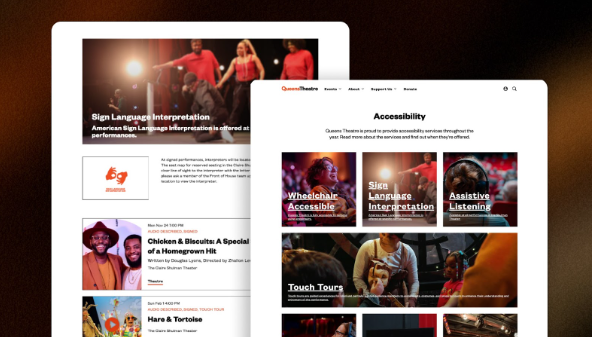
Queens Theatre uses dedicated accessibility pages to promote events with specific accessibility provisions.
Auckland Theatre Company does the same, offering relaxed performances, audio description, captioning and more.
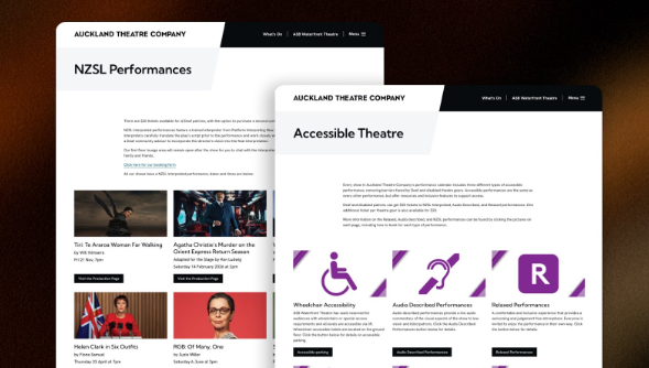
Auckland Theatre Company also has dedicated accessibility pages for more effective event discovery.
Family-friendly and themed content
Muziekgebouw in Amsterdam presents family concerts and festival programmes through curated theme pages – making it easy for parents or newcomers to orient themselves.

Curated events make it much easier for visitors to find events suitable for them and their needs. This also improves visitor experience and could boost return visits.
These pages complement the general calendar. They give visitors more ways to discover cultural events.
Discount and access pages – Ways to save
For many potential visitors, cost isn’t the real barrier. Uncertainty about cost is. Most venues offer a range of affordable options, yet these can be surprisingly hard to find.
Some organisations have addressed this head-on by creating dedicated “Ways to Save” pages. Auckland Theatre Company provides a great example, and Ticket Omaha does this brilliantly with their “Ways to Save” section, which includes pages for student rush tickets, promos and deals, group sales and season-ticket packages.
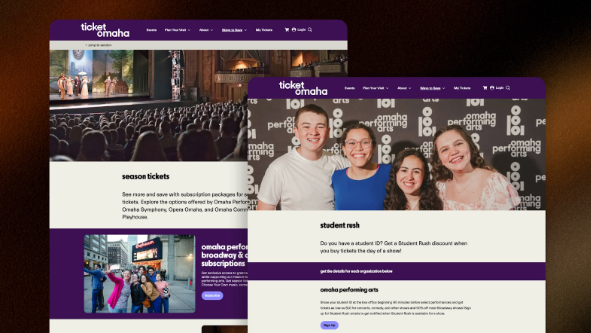
Pages like these speak directly to people who may be curious but hesitant. They signal openness, inclusivity, and affordability. They lower the psychological threshold to attendance, and they do it simply, transparently, and without compromising artistic value.
A new idea: Situational themes
One powerful idea that emerged during our conversations in Munich is to organise events by life situation rather than by artistic category. For example:
- See with your kids
- A great date night
- Bring your parents
- Perfect for first-time visitors
This framing mirrors how people actually plan their cultural outings. Few visitors search for “post-dramatic theatre with contemporary resonance”, but many ask: “What would be good for a Friday night with friends?”
Situational theming works because it reframes the decision. Instead of asking, “Which event do you want?”, it asks, “What are you trying to create?”

These pages also act as confidence triggers. They reduce doubt and reassure those who might otherwise avoid committing to a ticket. They can make new audiences feel seen and well taken care of.
Designing better bridges
Drawing from Patricia Stainer’s research and digital-platform best practices, three principles stand out:
Reduce assumed knowledge
Short summaries, expectation-setting and clear language make cultural content accessible to more people.
Make entry points broader and more personal
Visitors navigate by mood, situation and need—not genre.
Blend marketing and mediation
Good communication explains, guides and inspires. It doesn’t separate information from context.
A call to experiment and measure
Theme pages are a form of digital hospitality. They say: “We thought about people like you. Here’s a place to begin.”
Every venue has unused potential in how it presents its programme. Some pages might be permanent (accessibility, family events). Others might be seasonal (summer festivals) or experimental (date nights, first-time visitors). All of them widen the entrance to culture. And importantly: these experiments should be measured.
Tracking clicks on theme boxes helps you understand which pathways resonate. Adding simple UTM tags lets you follow these journeys through to ticket sales. Over time, this creates a learning loop that strengthens both communication and conversion.
If institutions combine creativity with evaluation, they will reduce hesitation, increase participation, and build bridges where thresholds once stood.
Ultimately, that is what cultural access is about: helping more people step into experiences that enrich their lives.
A CultureSuite article.