Cultural Content: Website ‘about’ pages
Cultural Content: Website ‘about’ pages
By
Georgina Brooke
Georgina Brook, Senior Content Strategist at One Further delves into 'about us' pages and the intricacies of getting across both what you are and why you do what you do. First published on the Cultural Content newsletter of digital specialists One Further.
It is a truth universally acknowledged that, if you want to delay a website launch, simply start a conversation about what should be on the new ‘About Us’ page.
Enter content strategy.
About pages are hard because, a bit like homepages, everyone has an opinion on them. But, added to that, you have the problem that some cultural institutions (*cough MUSEUMS cough*) are not very good at defining what they are as institutions anyway. It only took ICOM two years and four rounds of consultation to come up with a definition of ‘a museum’.
One of the easiest mistakes to make with an About page (and with web content more generally) is to write about what you think your head of department will sign off easily, not what your user wants to read.
This tends to result in About pages leading with internally-facing mission-and-vision statements and not what a user landing on this page might want to know.
What people want to know: in general
In general, folk on the About page want to know:
- What you are (think animal / mineral / vegetable, or look at the first sentence of your Wikipedia entry and try and improve upon that)
- Where you are
- A few key details on your historical significance (with a hyperlink to a fuller page on history)
- Why you exist (what you do and why)
- What’s it to them / why should they care? (Why do you exist in terms of serving your public?)
- Links to staff pages, policy/strategy pages
What people want to know: specialist
Sector professionals visiting an About page will want more specialist information. For example, the strategic plan and/or annual review, links to staff pages and contact details, and perhaps the history of the institution (this group is likely to be smaller than the others).
But this audience is generally a fraction of your total audience and tends to be over-catered for, as their needs are more intuitive to other museum staff. The pages they are after probably sit as child pages that live underneath/ are linked to on the About page.
What you are and why that matters
The way you design this information will be different for different kinds of institutions. The main art is getting across WHAT you are and WHY you do what you do in a way that doesn’t bat people over the head with internal-facing comms priorities.
Most visitors will want to know that you’re an art gallery before the fact that you’re aiming to be climate-neutral in five years.
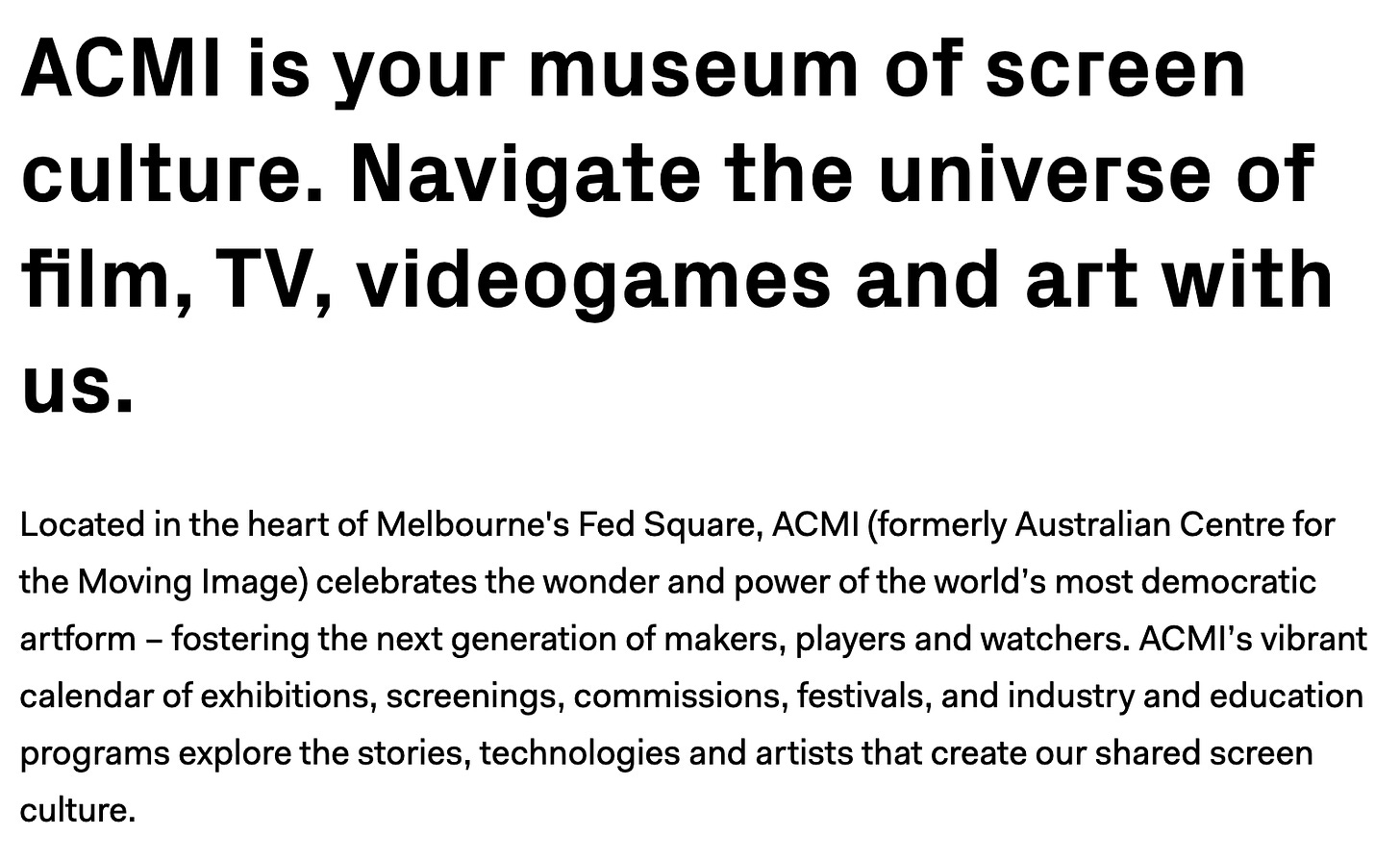
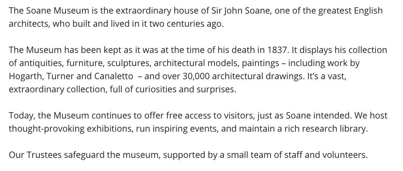
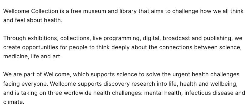
ACMI, Wellcome and the John Soane Museum all do a good job in their About page text of knitting together What They Are with Why That Matters (and why that matters to their visitors, not to their board):
What I like about this is:
- It uses the second person - this is ‘your’ museum. 90% of museum About pages tell visitors all about their (the institution’s) priorities but do little to draw or address the visitors themselves
- It clearly describes WHAT the museum is (and where it is based) and blends that nicely with WHY it exists
Here are a couple of other examples:
These all:
✅ Understand the primary assignment – tell users, in simple language – Who You Are
✅ Convey some of Why you exist, the history but also today’s purpose
✅ Manage to do both of the above in an interesting way
✅ Reference what they offer visitors / people (and don’t just spout internal mission statements)
✅ Don’t need to be too long/ comprehensive, this page can link into more detailed child pages around mission/ vision, policies, contact us – and so on.
By contrast, here are a couple that I think could do a bit better:
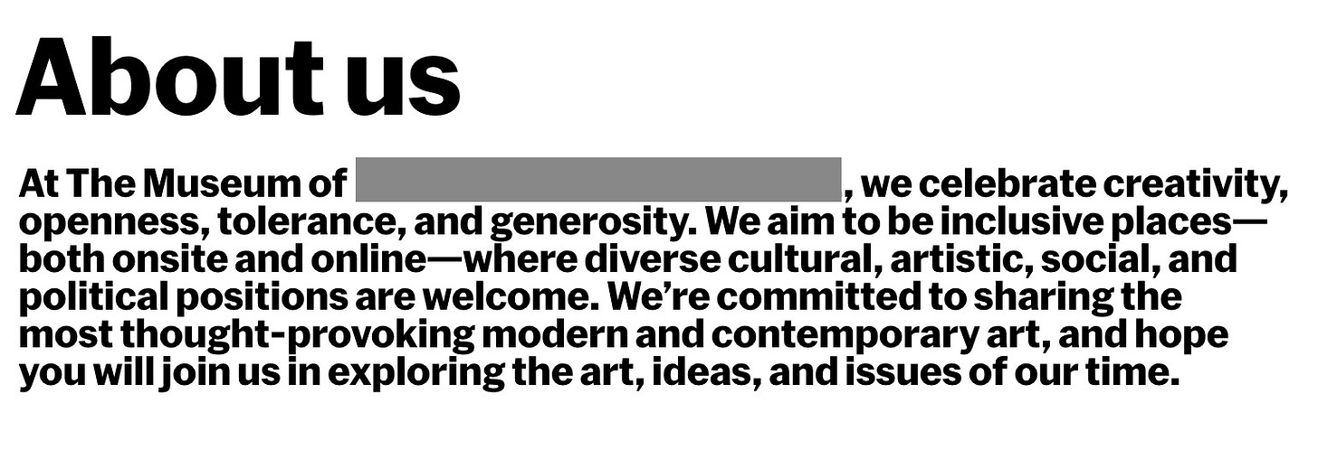
and
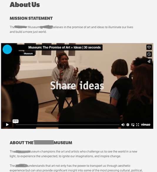
Both of these:
❌ Lead with what the organisation ‘believes’ - its positioning, mission and vision - so not directly answering the primary user need; which is to know what your institution is and how a visitor can meaningfully interact with it.
I feel welcomed by, and interested in, the first set of examples, and I feel like the Museum wishes to show it has committed to being welcoming in the second. There’s a difference.
To summarise…
About pages don’t need to be the headache they often become.
The key is to see things through the eyes of your website visitors. A number of About pages are very short in terms of their actual text – ACMI’s body copy text is presented in full here, the rest of the page then links to child pages such as Policies, Mission / Vision, and so on.
If you’re struggling to get collective sign-off on About page messaging there are ways you can test different options.
Software like UsabilityHub or Useberry allows you to run controlled studies in minutes. They also have a testing panel that you can tap into, which typically works out at about $1 per response. So for $60-$100, you could get a robust number of bias-free responses to different versions of an About page.
This allows you to A/B test important messaging – for example by uploading two different screenshots of the About page with different messaging and asking respondents for their preference.
Alternatively/additionally, you could ask participants to select adjectives they might associate with the page. You could then input adjectival input options like ‘corporate’, ‘accessible’, ‘welcoming’, ‘boring’, and ‘formal’ - and see how the different options come out.

Georgina Brooke - Content Strategist at One Further.
https://twitter.com/GeorginaBrooke
https://www.linkedin.com/in/georginabrooke/
https://georginabrooke.medium.com/
Cultural Content is a fortnightly newsletter about the intersection of web content and the cultural sector. It’s written by Georgina Brooke, Content Strategist at One Further, and guests.


